一、深入React技术栈之React简介
前言:用了一个半月的时间终于看完《深入React技术栈》这本书,也许是看过的React技术栈介绍最详细和深入的一本,激发了要系统性的学习和实践React技术栈的热情。接下来的日子里,就将这份热情融入到真正的学习和实践React技术中,对这本书中每一块精华知识进行梳理和总结。
1、React简介
React 是 Facebook 在2013年开源在Github上的 JavaScript 库,理论上讲 React 并非一个框架。在React中“万物皆组件”,有按钮组件 Button、对话框组件 Dialog,开发者通过组合这些组件,创建功能更丰富、交互更友好的页面。此外 React Native 也能用于原生移动应用的开发。React 有三大特点,分别是专注视图层、Vitual DOM 和函数式编程。
1.1、专注视图层
React 并不是完整的 MVC/MVVM 框架,它专注于提供清晰、简洁的 View 视图层解决方案,是一个包含 View 和 Controller 的库。 它仅提供极少量的 API 供开发者进行接近原生 JavaScript 的组件化开发。
1.2、Vitual DOM
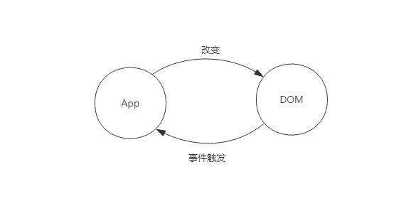
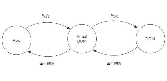
React 把真实 DOM 树转换成 JavaScript 对象即 Vitual DOM,提升了 React 的性能;此外 React 最大的好处在于方便和其他平台集成,例如 React-Native,只需要写一次组件,在 Web、Android、iOS上都可以运行。
1.3、函数式编程
| 编程方式 | 主要思想 |
|---|---|
| 命令式编程 | 关注计算机执行的步骤,即一步一步告诉计算机先做什么再做什么 |
| 声明式编程 | 以数据结构的形式来表达程序执行的逻辑,专注于做什么,而不是如何去做 |
| 函数式编程 | 对应声明式编程,专注于做什么,而非如何去做,但在做的时候没有“副作用” |
函数式编程是React 的精髓。React 把过去不断重复构建 UI 的过程抽象成了组件,在给定参数的情况下约定渲染对应的 UI界面。 React 能够充分利用函数式方法减少冗余代码。
2、JSX语法
2.1 、JSX 语法由来
React 通过创建于更新虚拟元素 (virtual element)来管理整个 Virtual DOM。虚拟元素可以理解为与真实元素的对应,主要分为 DOM 元素(DOM element) 和 组件元素(component element)。
(1)DOM 元素(以 button 元素为例)
<button classname="btn btn-blue">
    <em>Confirm</em>
</button>
HTML 元素由类型和属性两部分组成,转成 JSON 对象后,依然包含元素的类型和属性。
{
    type:'button',
    props:{
        className:'btn btn-blue',
        children:[{
            type:'em',
            props:{
                children:'Confirm'
            }
        }]
    }
}
(2) 组件元素 (以 Button 组件为例)
上述的 button 元素,可以用封装成一个构件按钮的公共方法。
const Button = ({color,text}) => {
    return {
        type:'button',
        props:{
            className:`btn btn-${color}`,
            children:{
                type:'em',
                props:{
                    children:text
                }
            }
        }
    }
}
在需要创建具体的按钮时,调用 Button({color:'blue',text:'Confirm'}) 即可。通过观察,Button 方法也可以作为元素存在,方法名对应元素的类型,参数则是元素的属性。用 JSON 结构描述如下:
{
    type:Button,
    props:{
        corlor:'blue',
        children:'Confirm'
    }
}
接下来封装一个更深的 Button 组件。
const DangerButton = ({text})=>({
    type:Button,
    props:{
        color:'red',
        children:text
    }
});
DangerButton 定义了一种新的“危险的按钮”组件,那么如何使用这个组件呢。接下来继续封装新的组件元素。
const DeleteAccount = ()=>({
    type:'div',
    props:{
        children:[{
            type:'p',
            props:{
                children:'Are you sure?'
            }
        },{
            type:DangerButton,
            props:{
                children:'Confirm'
            }
        },{
            type:Button,
            props:{
                color:'blue',
                children:'Cancel'
            }
        }]
    }
});
使用 JSX 重新表述上面的组件元素,只需要这么写:
const DeleteAccount = ()=>(
	<div>
   	    <p>Are you sure?</p>
        <DangerButton>Confirm</DangerButton>
        <Button color="blue">Cancel</Button>
    </div>
);
JSX j将 HTML 语法加入到 JavaScript 中,并通过 Babel 作为 JSX 的翻译器,转换为纯 JavaScript 后由浏览器执行,实现了“一处配置,统一运行”的目的。试着将 DeleteAccount 组件通过 Babel 转译成 React 可以执行的代码:
var DeleteAccount = function DeleteAccount() {
  return React.createElement(
  	'div', // type
     null,// pros
     React.createElement(
     	'p',
         null,
         'Are you sure?'// children
     ),
     React.createElement(
     	DangerButton,
         null,
         'Confirm'
     ),
     React.createElement(
     	Button,
        {color:'blue'},
        'Cancel'
     )
  );
};
2.2、JSX 基本语法
JSX官方定义是类 XML 语法的 ECMAScript 扩展。它完美地利用 JavaScript 的语法和特性,实现用 HTML 的语法来创建虚拟元。
2.2.1、基本语法
- 定义标签时,只允许被一个标签包裹。原因是一个标签会被转译成对应的 React.createElement 调用方法,最外层如果没有被包裹,显然无法转译成方法调用。
- 标签一定要闭合,否则无法通过编译。
2.2.2、元素类型
-
DOM元素(小写首字母)和组件元素(大写首字母);
-
注释,单行注释 {/* content */} , 多行注释 / * 多行注释 */ ;
2.2.3、元素属性
- class 属性改为 className;
- for 属性改为 htmlFor;
- 自定义标签(小驼峰写法)的属性可以传递,标签自带的属性无法传递;
- Boolean 属性,省略 Boolean 值默认bool 值为 true,要传 false,需要使用属性表达式;
<Checkbox checked />  {/* checked = true*/}
<Checkbox checked = {false} /> {/* checked = false*/}- 展开属性,可以使用 ES6 rest/spread 特性即扩展运算符来提高效率;
const data = {name:'foo',value:'bar'};
const component = <Component name={data.name} vaule={data.value} />
可以改写成:
const data = {name:'foo',value:'bar'};
const component = <Component {...data} />- 自定义 HTML 属性,React 是不会渲染自定义属性的,在 HTML 通常使用 data- 前缀表示,网络无障碍属性可用 aria-开头表示。
<div data-attr="xxx">content</div>
<div aria-hidden={true}>content</div>
2.2.4、JS 表达式
属性值要用 {} 替换 “”,来实现表达式的功能
{/*输入(JSX)*/}
const person = <Person name={window.isLoggedIn ? window.nane : ''} />
// 输入(JavaScript)
const person = React.createElement(
Person,
{window.isLoggedIn ? window.nane : ''}
)2.2.5、HTML 转义
React 会将所有要显示到 DOM 的字符串转义,以防止 XSS(Cross Site Scripting) 跨站脚本攻击攻击。以下是几种解决方法:
- 直接使用 UTF-8 字符 ©;
- 使用对应字符的 Unicode 编码查询编码;
- 使用数组组装
<div>{['cc ',<span>©</span>,' 2015]}</div>; - 直接通过 dangerouslySetInnerHTML属性
<div dangerouslySetInnerHTML={{_html:'cc & copy; 2015'}}/>3、React 组件
3.1 组件的演变
在 MV* 架构出现之前,组件主要分为两类:
- 狭义上指UI组件,例如 Tab 组件、Form组件,主要围绕交互动作,以 DOM结构或style样式实现;
- 广义上指带有业务含义和数据的UI组件组合,不仅有交互动作,而注重数据和界面的交互。
以常用的 Tabs 组件为例,UI 组件一定由结构(HTML)、样式(CSS)和交互行为(JavaScript)构成。对于 Tabs 组件,它的基本结构如下:
<div id="tab-demo">
    <div class="tabs-bar" role="tablist">
    	 <ul class="tabs-nav">
    		 <li role="tab" class="tabs-tab">Tabs1</li>
             <li role="tab" class="tabs-tab">Tabs2</li>
             <li role="tab" class="tabs-tab">Tabs3</li>
    	 </ul>
    </div>
    <div class="tabs-content">
       <div role="tabpanel" class="tabs-panel">
           第1个 Tab 里的内容
        </div>
        <div role="tabpanel" class="tabs-panel">
           第2个 Tab 里的内容
        </div>
        <div role="tabpanel" class="tabs-panel">
           第3个 Tab 里的内容
        </div>
    </div>
</div>
它的样式可以通过 SCSS 来定义,这样可以方便的定义 class 前缀,从而定义组件主题。
$class-prefix:"tabs";
#{$class-prefix} {
    &-bar {
        margin-bottom: 16px;
    }
    &-nav {
        font-size: 14px;
        &:after,
        &:before {
            display: table;
            content: "";
        }
        &:after {
            clear: both
        }
    }
    &-nav >&-tab {
        float: left;
        list-style: none;
        margin-right: 24px;
        padding: 8px 20px;
        text-decoration: none;
        color: #666;
        cursor: pointer;
    }
    &-nav >&-active {
        border-bottom: 2px solid #00b;
        color: #00b;
        cursor: default;
    }
    &-content &-panel {
        display:none;
    }
    &-content &-active {
        display: block;
    }
}
最后是交互行为,可以通过引入 jQuery 方便操作 DOM,使用 ES6 classes 语法糖来替换早期利用原型构建面向对象的方法,以及使用 ES6 modules 替换 AMD 模块加载机制。
import $ from 'jquery';
import EventEmitter from 'events';
const Selector = (classPrefix) => ({
    PREFIX: classPrefix,
    NAV: `${classPrefix}-nav`,
    CONTENT: `${classPrefix}-content`,
    TAB: `${classPrefix}-tab`,
    PANEL: `${classPrefix}-panel`,
    ACTIVE: `${classPrefix}-active`,
    DISABLE: `${classPrefix}-disable`,
});
class Tabs {
    static defaultOptions = {
        classPrefix: 'tabs',
        activeIndex: 0
    };
	constructor(options) {
        this.options = $.extend({},Tabs.defaultOptions,options);
        this.element = $(this.options.element);
        this.fromIndex = this.options.activeIndex;
        this.events = new EventEmitter();
        this.selector = Selector(this.options.classPrefix);
        this._initElement();
        this._initTabs();
        this._initPanels();
        this._bindTabs();
        if(this.options.activeIndex !== undefined) {
            this.switchTo(this.options.activeIndex);
        }
    }
	_initElement() {
        this.element.addClass(this.selector.PREFIX);
        this.tab = $(this.options.tabs);
        this.panels = $(this.options.panels);
        this.nav = $(this.options.nav);
        this.content = $(this.options.content);
        this.length = this.tabs.length;
    }
	_initTabs() {
        this.nav && this.nav.addClass(this.selector.NAV);
        this.tabs.addClass(this.selector.TAB).each((index,tab) => {
            $(tab).data('value',index);
        });
    }
	_initPanels() {
        this.content.addClass(this.selector.CONTENT);
        this.panels.addClass(this.selector.PANELS);
    }
	_bindTabs() {
        this.tabs.click((e) => {
            const $el = $(e.target);
            if(!$el.hasClass(this.selector.DISABLE)) {
               	this.switchTo($el.data('value'));
               }
        });
    }
	events(name) { return this.events; }
	switchTo(toIndex) { this._switchTo(toIndex); }
	_switchTo(toIndex) {
        const fromIndex = this.fromIndex;
        const panelInfo = this._getPanelInfo(toIndex);
        this._switchTabs(toIndex);
        this._switchPanel(panelInfo);
        this.events.emit('change',{ toIndex, fromIndex });
        this.fromIndex = toIndex;
    }
	_switchTabs(toIndex) {
        const tabs = this.tabs;
        const fromIndex = this.fromIndex;
        if(tabs.length < 1) return;
        tabs.eq(fromIndex)
        	.removeClass(this.selector.ACTIVE)
        	.attr('aria-selected',false);
        tabs.eq(toIndex)
        	.removeClass(this.selector.ACTIVE)
        	.attr('aria-selected',true);
    }
	_switchPanel(panelInfo) {
        panelInfo.fromPanels.attr('aria-hidden',true).hide();
         panelInfo.fromPanels.attr('aria-hidden',false).show();
    }
	_getPanelInfo(toIndex) {
        const panels = this.panels;
        const fromIndex = this.fromIndex;
        let fromPanels,toPanels;
        if (fromIndex > -1) {
            fromPanels = this.panels.slice(fromIndex,(fromIndex+1));
        }
        toPanels = this.panels.slice(toIndex,(toIndex+1));
        return {
            toIndex,
            fromIndex,
            toPanels: $(toPanels),
            fromPanels: $(fromPanels)
        };
    }
	destroy() { this.events.removeAllListeners(); }
}
实例化组件并传入必要的参数即可完成初始化的过程,实现交互效果。
const tab = new Tabs({
    element: '#tab-demo',
    tabs: '#tab-demo .tabs-nav li',
    panels: '#tab-demo .tabs-content div',
    activeIndex: 1,
});
tab.events.on("change",(o) => {
    console.log(o);
});
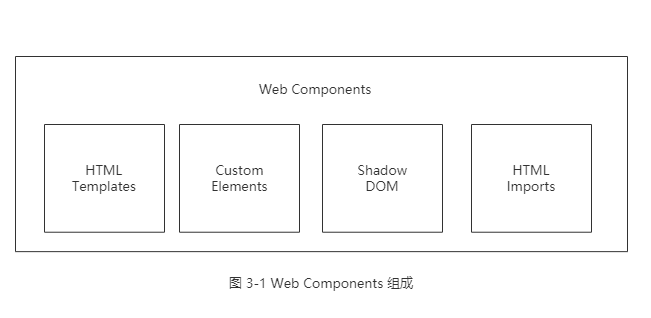
组件封装的基本思路就是面向对象思想,交互上基本以操作 DOM 为主,逻辑上是结构上哪里需要改变,就操作哪里。
3.2 组件的构建
React 组件基本上由3个部分组成 —— 属性(props),状态(state)以及生命周期方法,具体来说是组件的构建方式、组件内的属性状态与生命周期方法组成。
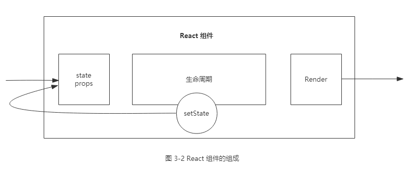
官方在 React 组件构建上提供了3种不同的方法: React.createClass、ES6 classes 和 无状态函数 (stateless function)。官方推荐 ES6 classes 和 无状态函数的写法。ES6 classes 示例代码如下:
import React, { Component } from 'react';
class Button extends Component {
    constructor(props) {
        super(props);
    }
    static defaultProps = {
        color: 'blue',
        text: 'Confirm'
    };
    render() {
        const { color, text } = this.props;
        return (
            <button className={`btn-${color}`}>
              <em> {text} </em>
            </button>
        );
    }
}
React 的所有组件都继承自顶层类 React.Component。在 React 组件开发中,常用的方式是将组件拆分到合理的粒度,用组合的方式合成业务组件。
用无状态函数构建的组件成为无状态组件,无状态组件只传入 props 和 context 两个参数,不存在 state,也没有生命周期方法,通过 props 和 context 实现 render 方法。其示例代码如下:
function Button({ color: 'blue', text: 'Confirm' }) {
    return (
        <button className={`btn-${color}`}>
              <em> {text} </em>
            </button>
    );
}
4、 React 数据流
在 React 中,数据是自顶向下(父组件 —> 子组件)单向流动的,从而使得组件之间的关联变得简单且可预测。如果顶层组件初始化 props,React 会向下遍历整棵组件树,尝试渲染所有相关的子组件。 而 state 只关心每个组件自己内部的状态,且该状态只能在组件内部通过 setState 进行改变。
4.1 、state
当组件内部使用 setState 方法时,最大的表现行为就是该组件尝试重新渲染,因为改变了内部状态,组件必然要更新。例如实现一个计数器组件:
import React, { Component } from 'react';
class Counter extends Component {
    constructor(props) {
        super(props);
        this.handleClick = this.handleClick.bind(this);
        this.state = { cout: 0 };
    }
    handleClick(e) {
        e.preventDefault();
        this.setState({
            count: this.state.count + 1,
        });
    }
    render() {
        return (
            <div>
                <p>{this.state.count}</p>
                <a href="#" onClick={this.handleClick}>更新</a>
            </div>
        );
    }
}
setState 是一个异步的方法,有了这个特性可以完成对行为的控制、数据的更新和页面的渲染。
4.2、props
props 是 properties 的缩写,是让不同组件相互联系的一种机制。 props 本身是不可变的,它的值一定来自于默认属性或通过父组件传递而来。如果要使用 props 加工后的值,最简单的方法是使用局部变量或直接在 JSX 中计算结果。
React 为 props 提供了默认配置项即 defaultProps 静态变量,在 render 方法中可通过 this.props获取。
在 React 中另一个重要且内置的 prop 是 children 属性,它代表组件的子组件集合。children 可以根据传入子组件的数量来决定是否是数组类型。前面 TabPane 组件调用过程可以翻译如下:
<Tabs classPrefix={'tabs'} defaultActiveIndex={0} className="tabs-bar">
    children={[
        <TabPane key={0} tab={'Tab1'}> 第1个 Tab 里的内容</TabPane>,
        <TabPane key={1} tab={'Tab2'}> 第2个 Tab 里的内容</TabPane>,
        <TabPane key={2} tab={'Tab3'}> 第3个 Tab 里的内容</TabPane>,
        ]}
</Tabs>
通过 React.Children.map 方法遍历子组件,React.Children 是 React 官方提供的一系列操作 children 的方法,此外还提供了 map、forEach、count 等实用函数。这种调用方式成为 Dynamic Children(动态组件),是通过声明式编程的方式实现的。
注意:与 map 函数相似但不返回调用结果的 forEach 函数不能这么使用。
对于 state ,它的通信集中在组件内部;对于 props 来说,它的通信是父组件向子组件的传播。
propTypes 是用于规范 props 的类型与必需的静态变量。如果组件定义了 propTypes,在开发环境下,就会对组件的 props 值的类型做检查,如果传入的 props 不能与之匹配, React 将在控制台里报 warning 提醒。先来看下 Tabs 组件的 propTypes:
static propTypes = {
    classPrefix: React.PropTypes.string,
    className: React.PropTypes.string,
    defaultActiveIndex: React.PropsTypes.number,
    activeIndex: React.PropsTypes.number,
    onChange: React.PropsTypes.func,
    children: React.PropsTypes.oneOfType([
        React.PropsTypes.arrayOf(React.PropsTypes.node),
        React.PropsTypes.node,
    ])
};
值得注意的是,在 propTypes 支持的基本类型中,函数类型的检查是 PropsTypes, 对于布尔类型的检查是 PropTypes.bool。
5、React 生命周期
React 生命周期分为两类:
- 当组件在挂载或卸载时;
- 当组件接收新的数据时,即组件更新时;
5.1 、挂载卸载
组件挂载的挂载过程主要做组件状态的初始化,推荐下面的例子为模板写初始化组件:
import React,{ Component } from 'react';
class App extends Component {
    static propTypes = {
        // ...
    };
    static defaultProps = {
        // ...
    };
    constructor(props) {
        super(props);
        this.state = {
            // ...
        };
    }
    componentWillMount() {
        // ...
    }
    componentDidMount() {
        // ...
    }
    render() {
        return (
            <p>this is a demo.</p>
            );
    }
 }
其中 componentWillMount() 会在 render() 之前执行,而 componentDidMount() 会在 render() 之后执行,且在组件初始化时运行一次。
在 componentWillMount() 中执行 setState() ,会发生什么呢? 组件会更新 state ,但组件只会渲染1次。这通常是无意义的执行,初始化时的 state 都可以放在 this.state 中。
在 componentDidMount() 中执行 setState(), 会发生什么呢?组件会更新 state,但组件会渲染2次,并不提倡在卸载是更新 state。
组件卸载非常简单,只有 componentDidMount(), 通常会执行一些清理方法,如事件回收或清除定时器。
import React,{ Component } from 'react';
class App extends Component {
    componentDidMount() {
        // ...
    }
    render() {
        return (
            <p>this is a demo.</p>
            );
    }
 }
5.2、组件的更新过程
更新过程是指父组件向下传递 props 或组件自身执行 setState() 时发生的一系列更新动作。这里暂时屏蔽了初始化的生命周期方法,以便观察更新过程的生命周期。
 import React,{Component} from 'react';
 class App extends Component {
    componentWillReceiveProps(nextProps) {
        // this.setState({})
    }
    shoudComponentUpdate(nextProps,nextState) {
        // return true;
    }
    componentWillUpdate() {
        // ...
    }
    componentDidUpdate() {
        // ...
    }
    render() {
        return (<div> this is a demo. </div>);
    }
 }
(1).组件自身的 state 更新,依次执行 shouldComponentUpdate()、componentWillUpdate()、render() 和 componentDidUpdate()。
shouldComponentUpdate 是一个特别的方法,它接收需要更新的 props 和 state,让开发者增加必要的条件判断,让其按需更新,即返回 true(默认) 时更新,返回false 时,组件不再向下执行生命周期方法。
对于没有生命周期方法的无状态组件,是不存在 shouldComponentUpdate()的,每次都会重新渲染。
注意,禁止在shouldComponetUpdate() 和 componentWillUpdate() 中执行 setState(),会造成循环调用,直至耗光浏览器内存后崩溃。
(2).父组件更新 props 而导致更新,在 shouldComponentUpdate() 之前会先执行 componentWillReceiveProps(), 此方法可以作为 React 在 props 传入之后,渲染之前 setState 的机会。
componentWillReceiveProps(nextProps) {
    if ('activeIndex' in nextProps) {
        this.setState({
            activeIndex: nextProps.activeIndex,
        });
    }
}
5.3 、整体流程
图片 1-10 React 生命周期整体流程图
此外使用 createClass 构建组件和 ES6 classes构建组件时,生命周期稍有不同。
| ES6 classes | createClass |
|---|---|
| static propTypes | propTypes |
| static defaultProps | getDefaultProps |
| construtor (this.state) |
getInitialState |
| componentWillMount | componentWillMount |
| componentDidMount | componentDidMount |
| componentWillReceiveProps | componentWillReceiveProps |
| shouldComponentUpdate | shouldComponentUpdate |
| componentWillUpdate | componentWIllUpdate |
| componentDidUpdate | componentDidUpdate |
| rendrer | render |
6、React 与 DOM
React 将涉及 DOM 操作的部分剥离到 ReactDOM 中,从而适用于 Web 开发。
6.1、ReactDOM
ReactDOM 中的 API 非常少,只有 findDOMNode、unMountComponentAtNode 和 render。
(1) findDOMNode, 在组件的生命周期中,DOM 被真正添加到 HTML 中的生命周期是 componentDidMount() 和 componentDidUpdate(),因此 fIndDOMNode() 只能在这两个生命周期中发挥作用。
(2)一般只有在顶层组件时,才不得不使用 ReactDOM,此时要用到 render 方法,例如:
const Demo = ReactDOM.render(<App/>,document.getElementById('root'));6.2、refs
refs 是 React 组件中非常特殊的 prop,可以附加到任何一个组件上。refs 即 referrence,组件被调用时会新建一个该组件的实例,而 refs 指向这个实例。它可以是一个回调函数,也可以是一个字符串。
当 ref 是回调函数时,会在组件被挂载后立即执行。例如:
import React, { Component } from 'react';
class App extends Component {
    constructor(props) {
        super(props);
        this.handleClick = this.handleClick.bind(this);
    }
    handleClick() {
        if (this.myTextInput !== null) {
            this.myTextInput.focus();
        }
    }
    render() {
        return (
            <div>
                <input type="text" ref={() => this.myTextInput = ref} />
                <input
                    type="button"
                    value="Focus the text input"
                    onClick={this.handleClick} />
            </div>
        );
    }
}
当 ref 是字符串时,不仅可以使用 findDOMNode 获得该组件的 DOM,还可以使用 refs 获得组件内部的 DOM,比如:
import React, { Component } from 'react';
import ReactDOM from 'react-dom';
class App extends Component {
    constructor(props) {
        super(props);
    }
    componentDidMount() {
        // myComp 是 Comp 的一个实例,因此需要用 findDOMNode 转换为相应的 DOM
        const myComp = this.refs.myComp;
        const dom = ReactDOM.findDOMNode(myComp);
    }
    render() {
        return (
            <div>
                <Comp ref="myComp" />
            </div>
            );
    }
}
要获取一个 React 组件的引用,既可以使用 this 来获取当前 React 组件,也可以使用 refs 来获取你拥有的子组件的引用。
为了防止内存泄露,当卸载一个组件时,组件里所有的 refs 会变成 null。此外,findDOMNode 和 refs 都无法用于无状态组件中,因为无状态组件挂载时只是方法调用,没有新建实例。
7、实例:Tabs组件
本次实例使用的 react 版本 和 react-dom 版本为 ~15.0.2,具体 package.json 文件如下:
{
  "name": "react-book-examples",
  "description": "第一章 Tabs 组件",
  "repository": {
    "type": "git",
    "url": "https://github.com/arcthur/react-book-examples"
  },
  "scripts": {
    "start": "cross-env NODE_ENV=development node server.js"
  },
  "license": "MIT",
  "devDependencies": {
    "babel": "^6.5.2",
    "babel-cli": "^6.8.0",
    "babel-core": "^6.8.0",
    "babel-loader": "^6.2.4",
    "babel-plugin-react-transform": "^2.0.0",
    "babel-preset-es2015": "^6.6.0",
    "babel-preset-react": "^6.5.0",
    "babel-preset-stage-0": "^6.5.0",
    "cross-env": "^3.1.4",
    "css-loader": "^0.23.1",
    "express": "^4.13.4",
    "node-sass": "^3.10.1",
    "react-hot-loader": "^1.3.0",
    "react-transform-catch-errors": "~1.0.2",
    "react-transform-hmr": "~1.0.4",
    "redbox-react": "^1.3.1",
    "sass-loader": "^4.0.2",
    "style-loader": "^0.13.1",
    "webpack": "^1.13.0",
    "webpack-dev-middleware": "^1.8.3",
    "webpack-dev-server": "^1.16.1",
    "webpack-hot-middleware": "^2.12.2"
  },
  "dependencies": {
    "classnames": "^2.2.5",
    "react": "~15.0.2",
    "react-dom": "~15.0.2"
  }
}
7.1、第一部分:Tabs 组件
Tabs 需要把 props 克隆到 TabNav 或 TabContent 组件中。Tabs 组件中通过切换 tab 时的 onChange 函数,传递 onChange prop 到 TabNav 子组件中,在子组件完成对节点上事件的绑定。
import React, { Component, PropTypes, cloneElement } from 'react';
import classnames from 'classnames';
import style from './tabs.scss';
class Tabs extends Component() {
    static propType = {
        // 在主节点上增加可选 class
        className: PropTypes.string,
        // class 前缀
        classPrefix: PropTypes.string,
        children: PropTypes.oneOfType([
            PropTypes.arrayOf(PropTypes.node),
            PropTypes.node
        ]),
        // 默认激活索引,组件内更新
        defaultActiveIndex: PropTypes.number,
        // 默认激活索引,组件外更新
        activeIndex: PropTypes.number,
        // 切换时回调函数
        onChange: PropTypes.func,
    };
    static defaultProps = {
        classPrefix: 'tabs',
        onChange: () => {},
    };
    constructor(props) {
        super(props);
        // 对事件方法的绑定
        this.handleTabClick = this.handleTabClick.bind(this);
        const currentProps = this.props;
        let activeIndex;
        // 初始化 activeIndex state
        if ('activeIndex' in currentProps) {
            activeIndex = currentProps.activeIndex;
        } else if ('defaultActiveIndex' in currentProps) {
            activeIndex = currentProps.defaultActiveIndex;
        }
        this.state = {
            activeIndex,
            prevIndex: activeIndex,
        };
    }
    componentWillReceiveProps(nextProps) {
        // 如果 props 传入 activeIndex,则直接更新
        if ('activeIndex' in nextProps) {
            this.setState({
                activeIndex: nextProps.activeIndex,
            });
        }
    }
    handleTabClick(activeIndex) {
        const prevIndex = this.state.activeIndex;
        // 如果当前 activeIndex 与 传入的 activeIndex 不一致,
        // 并且 props 中存在 defaultActiveIndex 时,则更新
        if (this.state.activeIndex !== activeIndex && 'defaultActiveIndex' in this.props) {
            this.setState({
                activeIndex,
                prevIndex,
            });
            // 更新后执行回调函数,抛出当前索引和上一次索引
            this.props.onChange({ activeIndex, prevIndex });
        }
    }
    renderTabNav() {
        const { classPrefix, children } = this.props;
        return (
            <TabNav
                key="tabBar"
                classPrefix = {classPrefix}
                onTabClick = {this.handleTabClick}
                panels = {children}
                activeIndex = {this.state.activeIndex}
            />
        );
    }
    renderTabContent() {
        const { classPrefix, children } = this.props;
        return (
            <TabContent
                key="tabcontent"
                classPrefix = {classPrefix}
                panels = {children}
                activeIndex = {this.state.activeIndex}
            />
        );
    }
    render() {
     const { className } = this.props;
     // classnames 用于合并 class
     const classes = classnames({ className, 'ui-tabs' })
     return (
         <div className={classes}>
                {this.renderTabNav()}
                {this.renderTabContent()}
            </div>
     );
 }
}
7.2、第二部分:TabNav 组件
TabNav 组件与 TabContent 组件处理的逻辑相似,不同的是前者是从 TabPane 组件的 tab prop 中获得内容,后者是从 TabPane 组件的 children 中取得内容。
import React, { Component, PropTypes, cloneElement } from 'react';
import classnames from 'classnames';
import style from './tabs.scss';
class TabNav extends Component {
    static propType = {
        classPrefix: PropTypes.string,
        panels: PropTypes.node,
        activeIndex: PropTypes.number,
        onTabClick: PropTypes.func,
    };
    getTabs() {
        const { panels, classPrefix, activeIndex } = this.props;
        return React.Children.map(map, (child) => {
            if (!child) { return; }
            const order = parseInt(child.props.order, 10);
            // 利用 class 控制显示和隐藏
            let classes = classnames({
                [`${classPrefix}-tab`]: true,
                [`${classPrefix}-active`]: activeIndex === order,
                [`${classPrefix}-disabled`]: child.props.disabled,

            });
            let events = {};
            if (!child.props.disabled) {
                events = {
                    onClick: this.props.onTabClick.bind(this, order),
                };
            }
            const ref = {};
            if (activeIndex === order) {
                ref.ref = 'activeTab';
            }
            return (
                <li
                    role="tab"
                    aria-disabled={child.props.disabled ? true : false}
                    aria-selected={activeIndex === order ? true : false}
                    {...events}
                    className = {classes}
                    key={order}
                    {...ref}
                >
                    {child.props.tab}
                </li>
            );
        });
    }
    render() {
        const { classPrefix } = this.props;
        const rootClasses = classnames({
            [`${classPrefix}-bar`]: true,
        });
        const classes = classnames({
            [`${classPrefix}-nav`]: true,
        });
        return (<div className={rootClasses} role='tablist'>
            <ul className={classes}>
                {this.getTabs()}
            </ul>
        </div>);
    }
}
7.3、第三部分:TabContent 组件
import React, { Component, PropTypes, cloneElement } from 'react';
import classnames from 'classnames';
import style from './tabs.scss';
class TabContent extends Component {
    static propType = {
        classPrefix: PropTypes.string,
        panels: PropTypes.node,
        activeIndex: PropTypes.number,
    };
    getTabPanes() {
        const { classPrefix, panels, activeIndex } = this.pros;
        return React.Children.map(panels, (child) => {
            if (!child) { return; }
            const order = parseInt(child.props.order, 10);
            const isActive = activeIndex === order;
            return React.cloneElement(
                classPrefix,
                isActive,
                children: child.props.children,
                key: `tabpane-${order}`,
            );
        });
    }
    render() {
        const { classPrefix } = this.props;
        const classes = classnames({
            [`${classPrefix}-content`]: true,
        });
        return (
            <div className={classes}>
                {this.getTabPanes()}
            </div>
        );
    }
}
7.3、第四部分:TabPane 组件
最后是 TabPane 组件,它是最末端的节点,只有基本的渲染。
import React, { Component, PropTypes, cloneElement } from 'react';
import classnames from 'classnames';
import style from './tabs.scss';
class TabPane extends Component {
    static propType = {
        tab: PropTypes.oneOfType([
            PropTypes.string,
            PropTypes.node,
        ]).required,
        order: PropTypes.string.required,
        disabled: PropTypes.bool,
        isActive: PropsTypes.bool,
    };
    render() {
        const { classPrefix, className, isActive, children } = this.props;
        const classes = classnames({
            [className]: className,
            [`${classPrefix}-panel`]: true,
            [`${classPrefix}-active`]: isActive,
        });
        return (
            <div role="tabpanel" className={classes} aria-hidden={!isActive}>
                {children}
            </div>
        );
    }
}
自此,Tabs 组件就开发完毕了。